
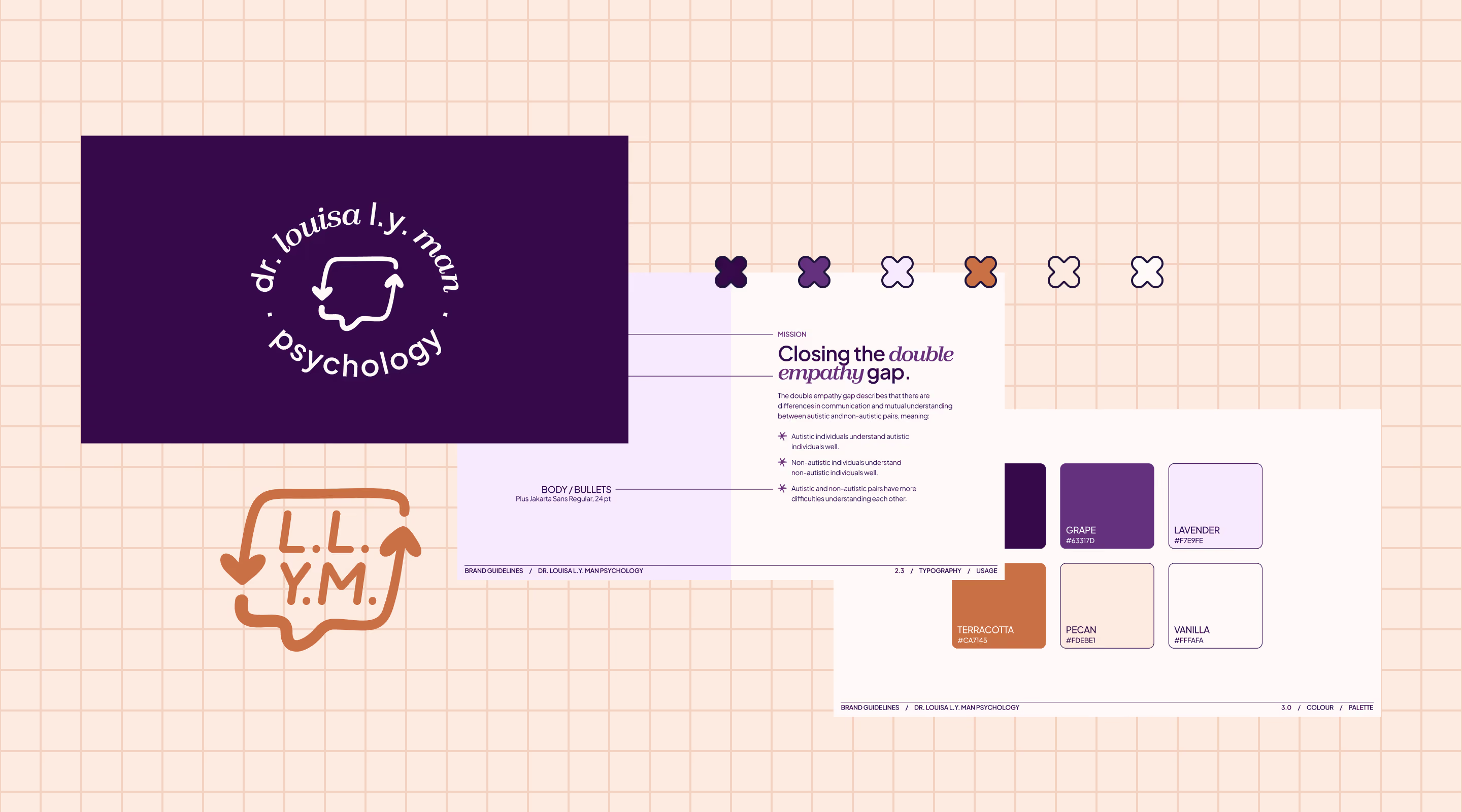
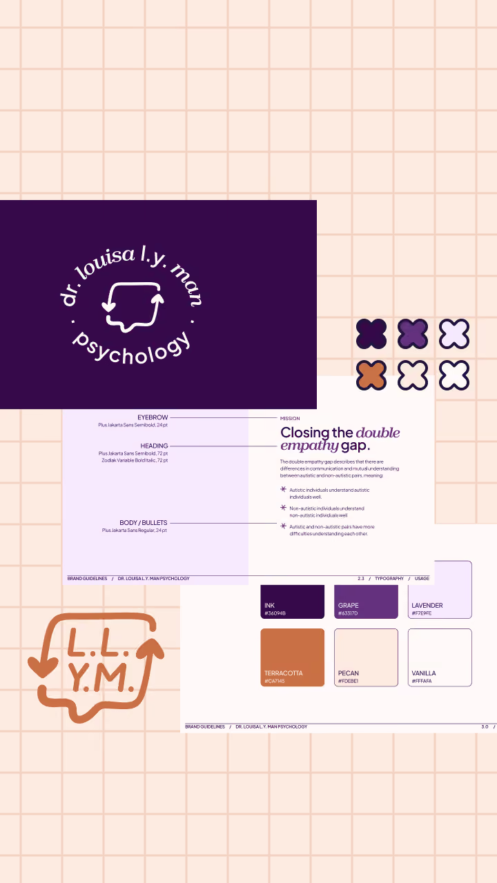

I was approached by Dr. Louisa Man for support on building a brand guide and social media templates for her psychology practice, which specialises in supporting neurodivergent individuals, particularly those with Autism and ADHD.
I was approached by Dr. Louisa Man for support on building a brand guide and social media templates for her psychology practice, which specialises in supporting neurodivergent individuals, particularly those with Autism and ADHD.
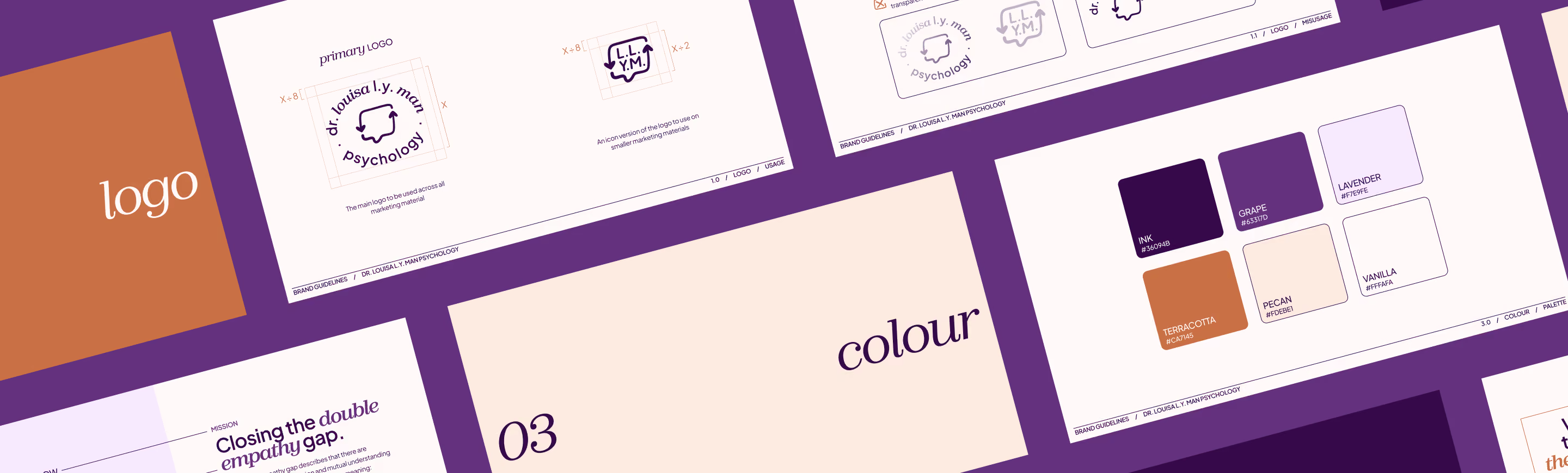
Accessibility shaped nearly every decision. Since Louisa's practice emphasises diversity within neurodiversity, the colour palette had to appeal to a range of preferences; engaging enough for sensory seekers, without tipping into high-contrast territory for those with sensory sensitivities.
Accessibility shaped nearly every decision. Since Louisa's practice emphasises diversity within neurodiversity, the colour palette had to appeal to a range of preferences; engaging enough for sensory seekers, without tipping into high-contrast territory for those with sensory sensitivities. We landed on deep purples and warm oranges — a palette that also complements CAMH, an organisation Louisa partners with frequently.






One of Louisa’s core missions is closing the “double empathy gap” — to bridge the difference in communication between neurodivergent and neurotypical people. I used a speech bubble with heart-shaped arrows in the logo design to represent this recurring theme of her practice.
One of Louisa’s core missions is closing the “double empathy gap” — to bridge the difference in communication between neurodivergent and neurotypical people. I used a speech bubble with heart-shaped arrows in the logo design to represent this recurring theme of her practice.

Accessibility extended to type as well. We paired a sans-serif with a serif font, both set large for legibility and visual impact. Louisa’s practice serves youth and adults alike, so the serif's lowercase styling creates the feeling of approachability.
Accessibility extended to type as well. We paired a sans-serif with a serif font, both set large for legibility and visual impact. Louisa’s practice serves children and adults alike, so the serif's lowercase styling creates the feeling of approachability.
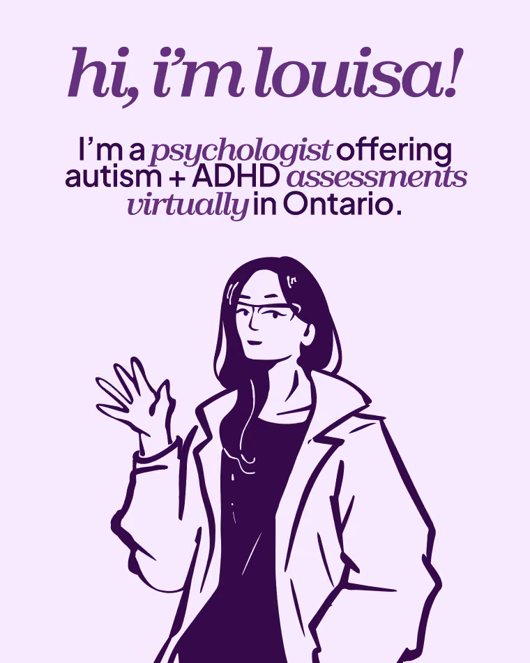
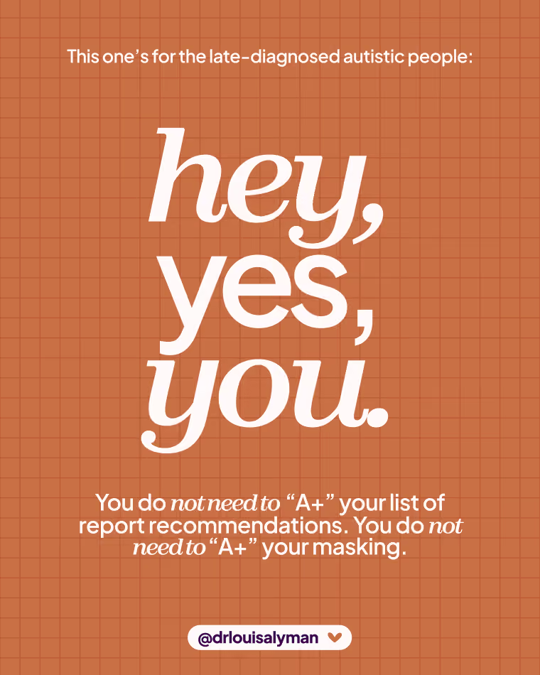
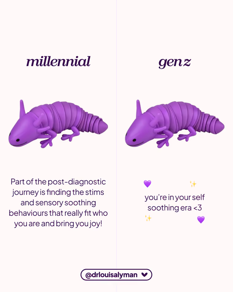
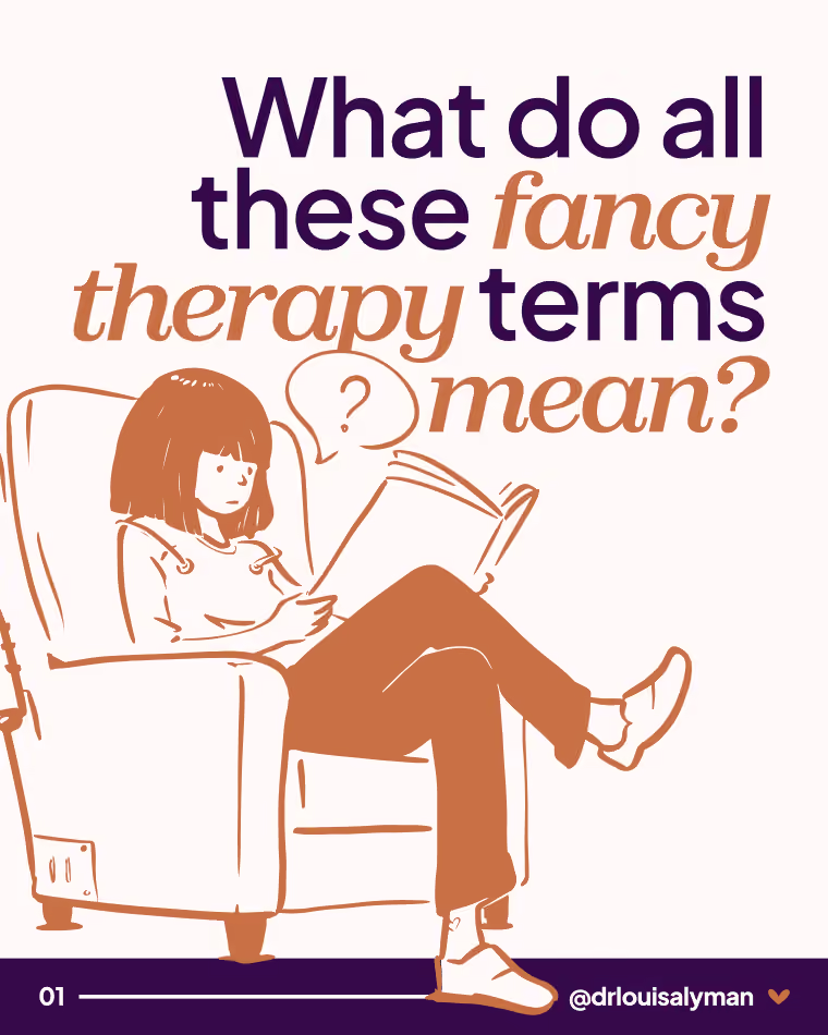
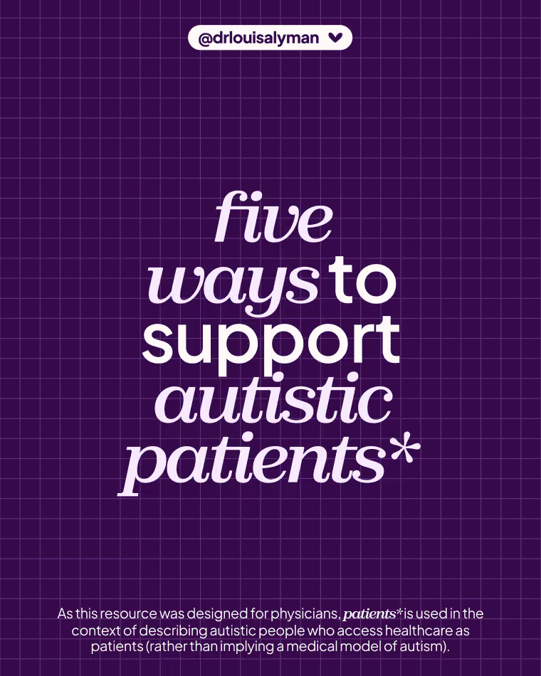
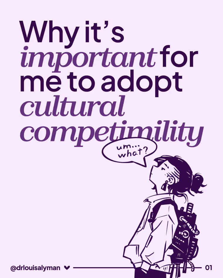
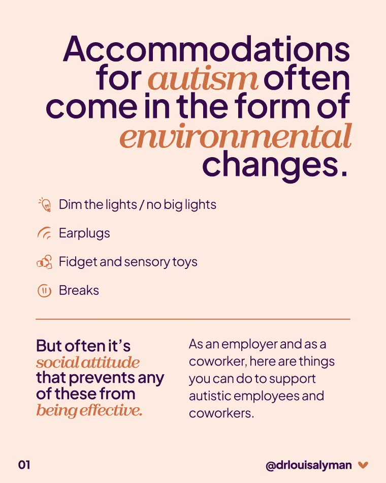
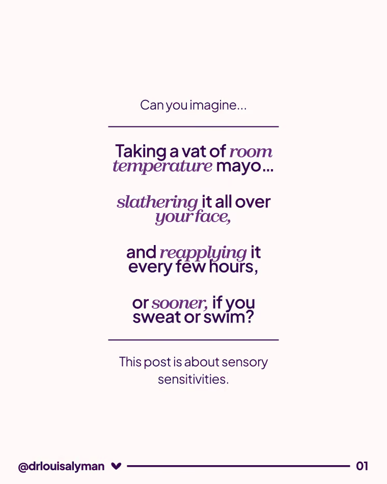
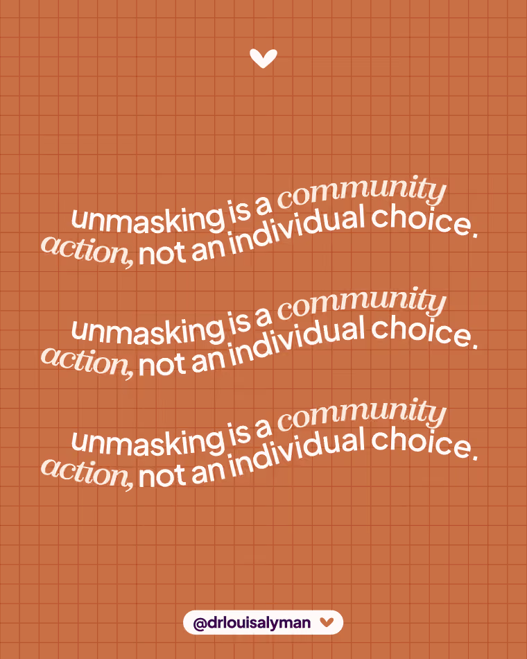
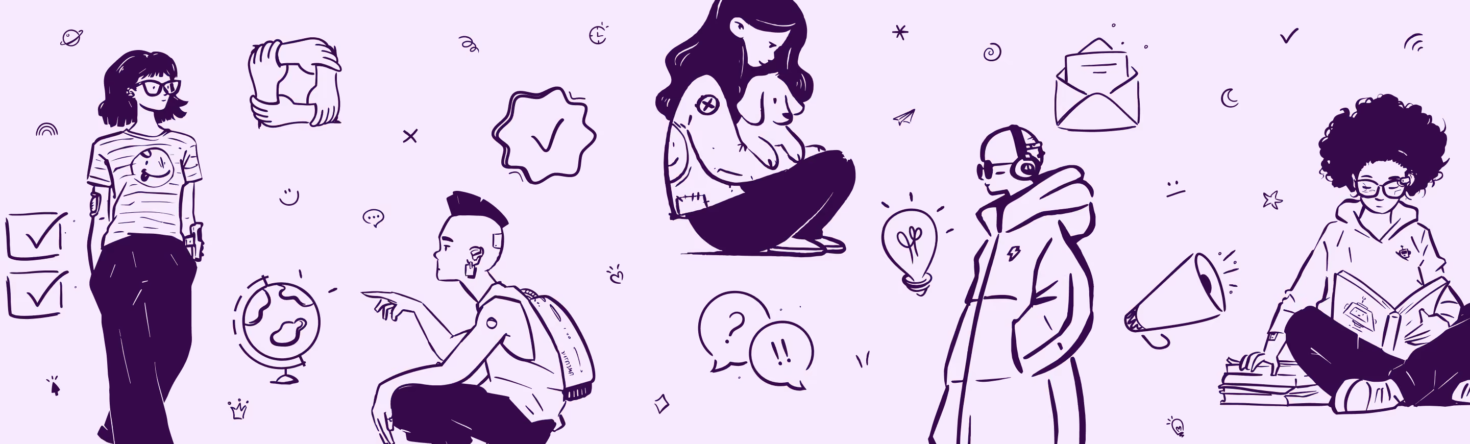
Louisa needed to be able to create her own assets going forward, so I built her templates from large, open-source illustration and icon libraries, then customised them to fit the brand.
Louisa needed to be able to create her own assets going forward, so I built her templates from large, open-source illustration and icon libraries, then customised them to fit the brand.
Our partnership worked so well that Louisa brought me on to continue managing her social content — and the on-brand resource library now makes that ongoing work more efficient for both of us!
Our partnership worked so well that Louisa brought me on to continue managing her social content — and the on-brand resource library now makes that ongoing work more efficient for both of us!


